


“Once we get past the tedium of building the same thing over and over again we can focus our energy on more worthwhile tasks like accessibility, performance, and iteration. We can work on the fun stuff rather than the tedious things.”
-Micah Godbolt
As with many other fast-growing startups, Utrust was having inconsistent User Experience due to a lack of a design system.
Auditing current products
Utrust had 3 main products when we started on this initiative. Merchant Dashboard for business customers, Payment Widget for buyers, and a very detailed Management Tool for internal users.
And we were about to revamp the Payment Widget to Payment Gateway with new functionalities and a much better experience so it was a good time to unionize the design language and fix the inconsistencies.
To provide:
- The same language between devs/engs and designers
- Consistent user experience across platforms/products
- Time savings through not designing/implementing same-ish components each time
- To create a structure for language, communication, file organization, documentation
Key findings
Inconsistency
Not having a structured design system means every new designer or every new feature will have the potential to be remade slightly differently. These slight differences add up to repetitive work and worsen the user experience.
Building the Design System of Utrust
When I first joined Utrust, they had a very primitive design library with no corresponding components on the implementation side, I took initiative and very closely worked with -mainly- front-end developers and the other product designer to start a design system.
Atomic Design
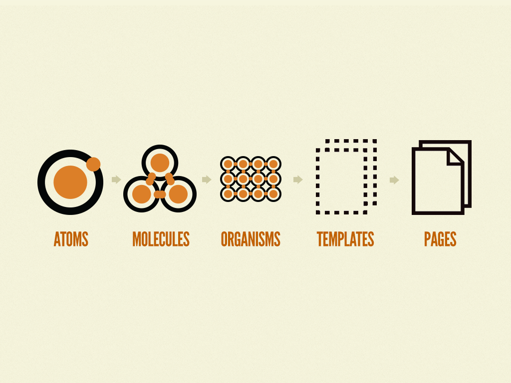
I’m a big fan of @Brad Frost’s Atomic Design book. A couple of years ago I was in the process of understanding the design systems much better (there were not many established design systems then and the ones that were, were not this big) I was experimenting with different approaches to come up with an ideal boilerplate for me and my team. So when I read the “Atomic Design” it made perfect sense and accelerated my understatement of building a design system. I’ve been following the same principle for years now, optimizing it for the team and the product(s) every time, one project at a time…

Accessibility FTW
I believe every designer should go to extra mile to make sure their designs are as inclusive as possible. So I test to make sure they meet W3 Standards. So the design system provides the text color - background color combination right on the color palettes to guide the current and future designers to use accessible colors.

This screenshot displays the available text color usage on top of the background colors of our “Royal” color palette.
Adaptivity is built-in
Our components are built to be adaptive. Some of them are designed to be displayed and worked the same across platforms but some of them are specifically designed for each platform. For example; data-heavy tables are toggleable on mobile and displayed as full rows in a more classic view on desktop views.

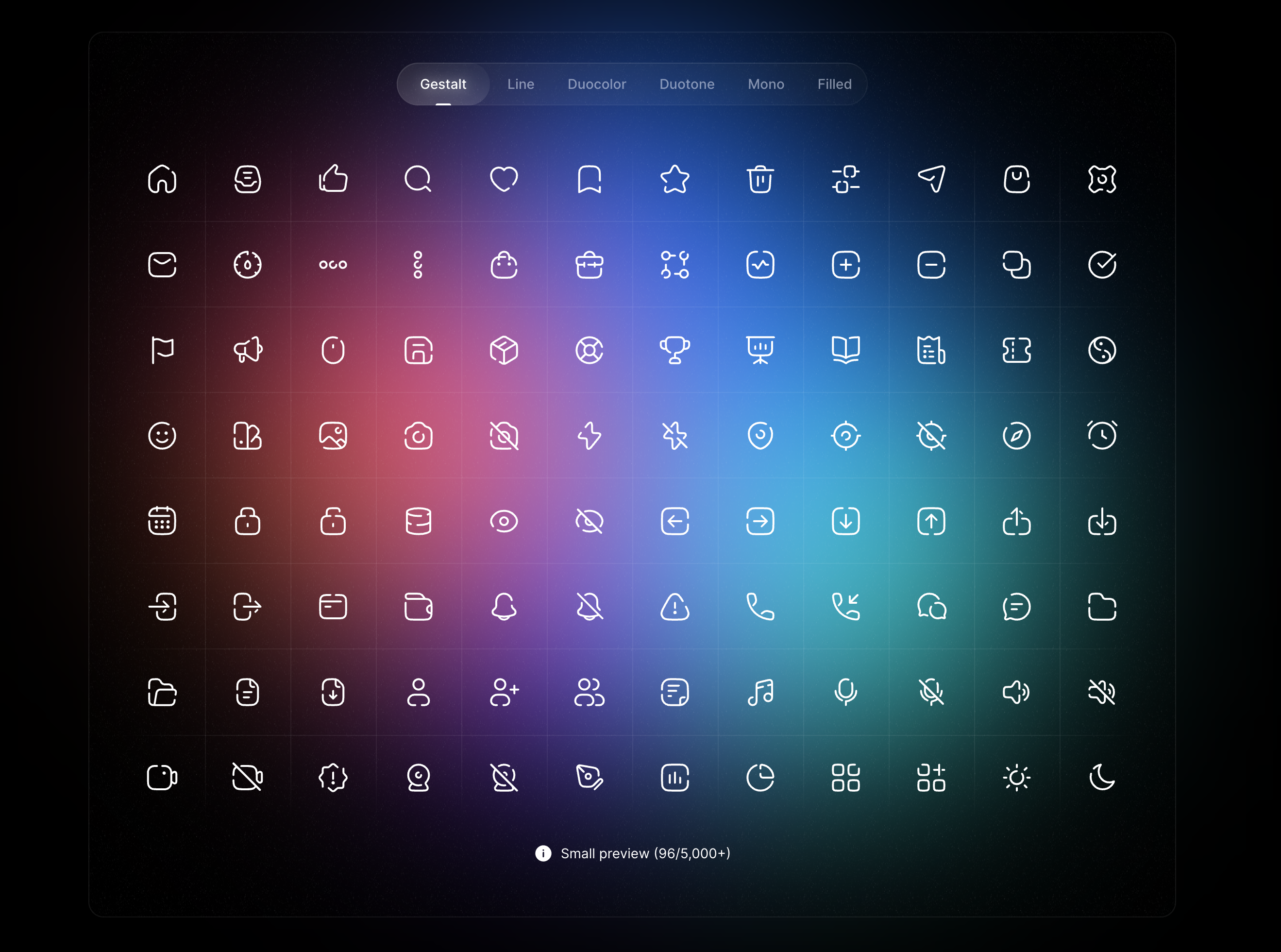
Icon Library
Initially, we started making our own icons. This was so we don’t spend any extra resources on this initiative but since none of the product designers in the team was an illustrator we quickly realized that we made a mistake and designing and maintaining our own library is going to cost us much more. So we started looking at some alternatives, a library that we can use and not worry about the time we spend on maintaining it.
After a while of testing different options and researching, we finally settled on Anron Icons.
Over-documenting is underrated
I like to document my designs excessively. I explain my thought process, how I like things to be implemented, and why it’s supposed to be implemented as described.
Over the years I’ve been doing this I got excellent feedback, people seem to understand more and genuinely feel that they are designing with me, their thoughts are appreciated and they are a part of the design process. I leave documentation cards along with some discussion point cards for people to leave their thoughts openly.

Design Language
At Utrust we’ve included the language rules in our product design library. This was done to ensure consistency across texts and the communications we have with our users.
Title rules:
Titles should always be in title case, heavier weight than the paragraph, and should follow our title text styles.
UX Wording:
We prefer to have friendly wordings, this means abbreviations, emojis, and puns are welcome!

Final Thoughts
Product design systems are sort of living beings, in a sense, they change and adapt to their living standards… Our Design system is currently being used on 2 Products and the impact of having a constructed design system is clear even now.
Utrust’s Design System is a baby, over time it’ll grow into an adult design system.
Impact:
We are using it on the Revamp of the Payment Gateway and a new product that hasn’t been announced yet. So far;
- Designers are faster at building new layouts and pages.
- Designers are way more focused on solving the actual problem rather than unwillingly focusing too much on how things look together.
- Developers are much faster at implementing the pages.
- Design and Developer relations are much better because we are all talking the same language.
The design system is living on Storybook as React Components. This way the Design QA is much simpler and we have documentation on the implementation as well as documentation on the designs.