GDS: The Graph Design System
Taking over design system efforts at The Graph while shipping product work. 60+ components, 100% design-dev parity, and custom tooling to support the process.
Context
When I joined The Graph, I was told I'd take over design system efforts within a few months while continuing to ship product work. There was no dedicated team.
The existing system had components but they weren't built with design system principles. Prop names didn't follow conventions, variants were inconsistent, and what existed in Figma rarely matched what existed in code. A select component in Figma might have completely different states than the one engineers were working with. Designers and engineers were essentially working from different sources of truth, and handoffs reflected that.
The Work
I started by auditing what existed and understanding why it wasn't working. Components had been built as one-offs, solving immediate needs without considering how they'd scale or connect to each other. Fixing this meant rebuilding from the ground up while keeping the system usable for teams who depended on it.
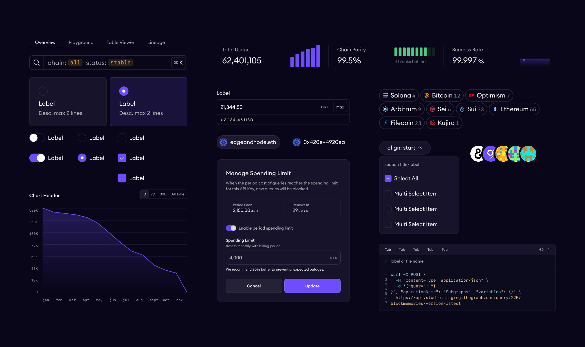
The work happened incrementally over months. I rebuilt form controls, buttons, navigation patterns, feedback components, and data display elements. I also added crypto-specific components that didn't exist anywhere else because no off-the-shelf library covers things like wallet selectors or token inputs.
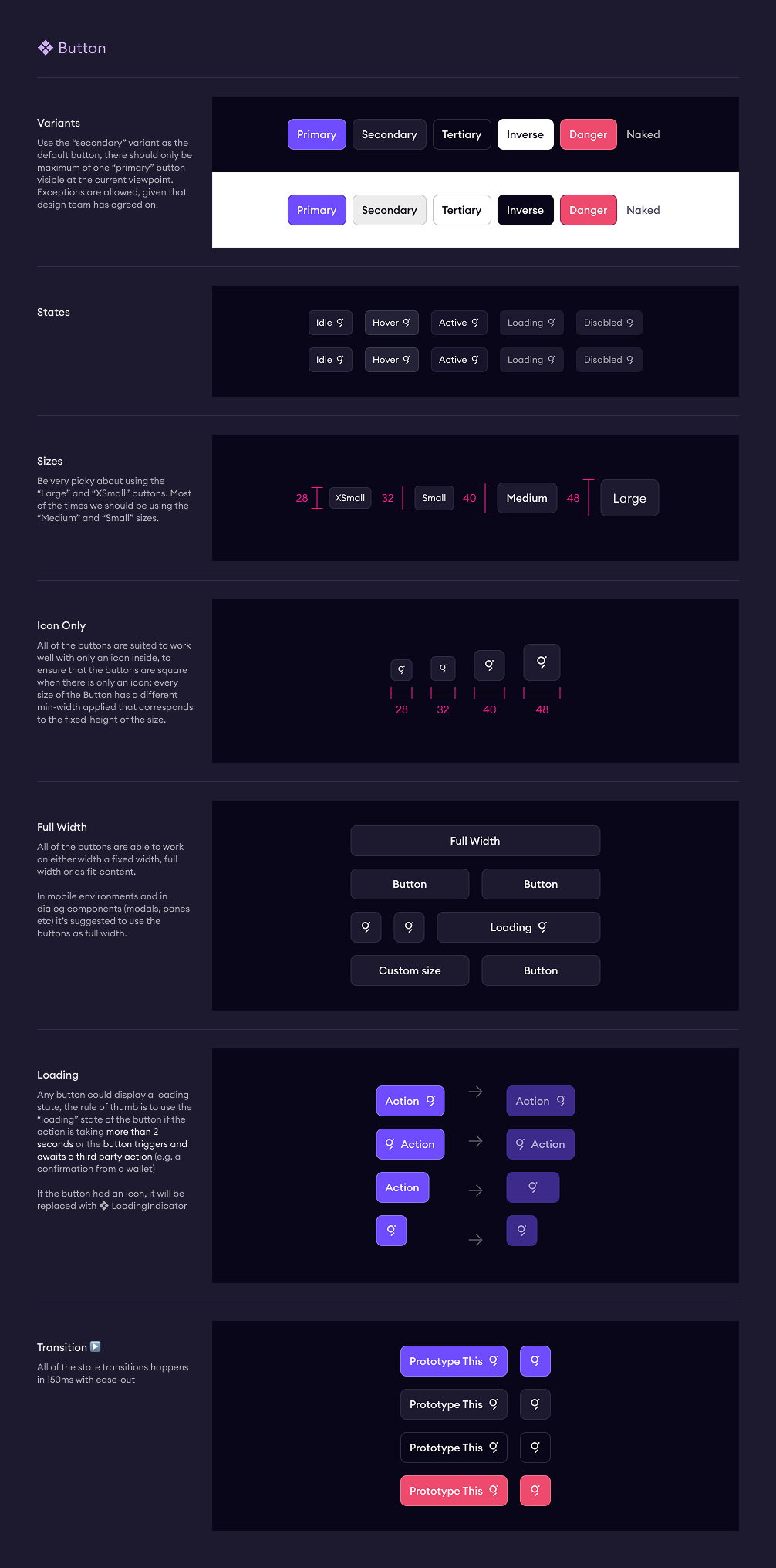
The goal was 100% design-to-dev parity. What you see in Figma matches the code exactly: styling, functionality, prop names, prop values, defaults. If a button component in Figma has a variant prop with options primary, secondary, and naked, the React component has the same. Engineers don't have to guess or translate. Every component has documentation covering usage, properties, and default values.
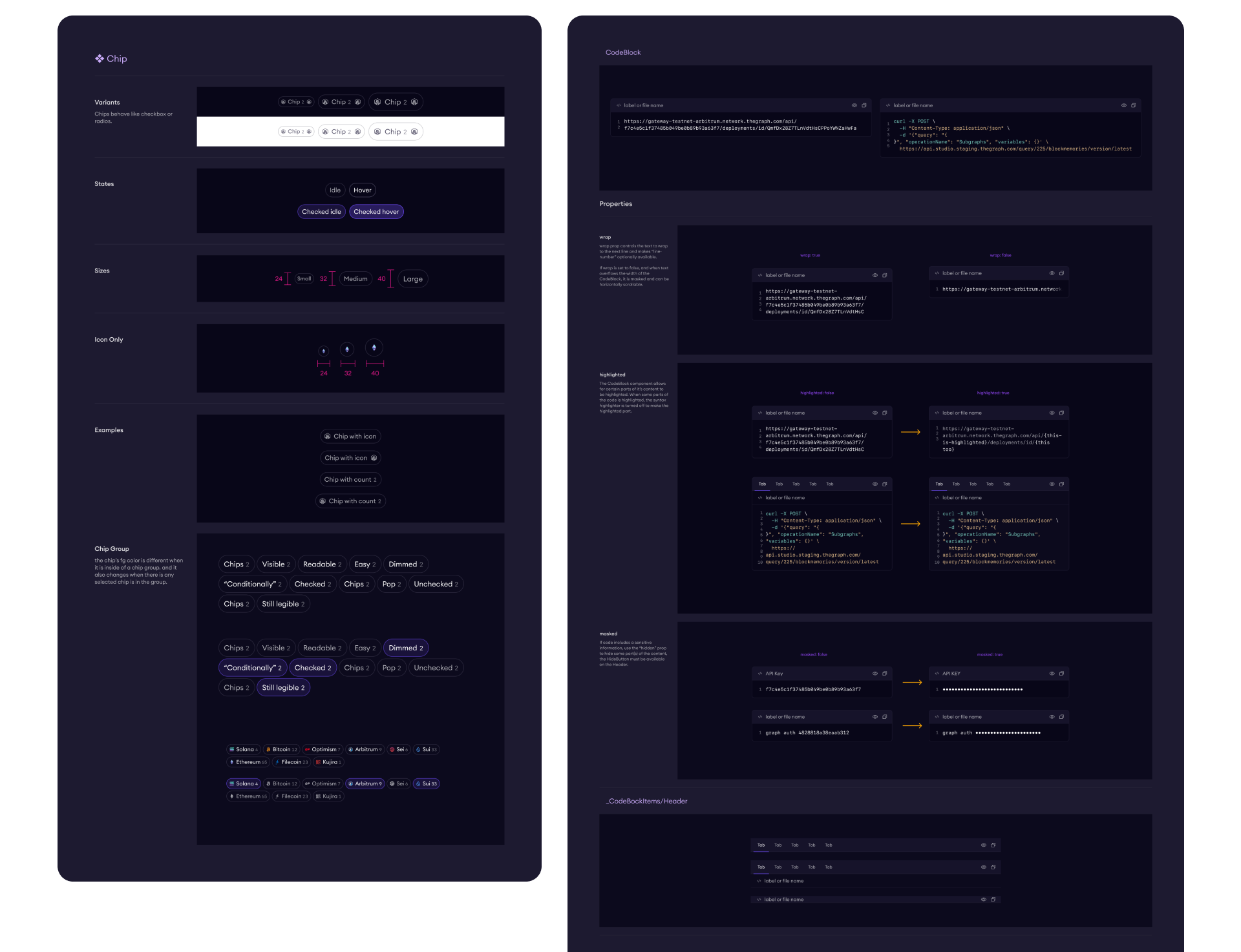
The system now has over 60 components and a complete token architecture for color, spacing, and typography.
Tooling
Some problems didn't have existing solutions, so I built them.
When consolidating design tokens, I needed to understand what was actually being used across our Figma files. Which colors appeared where, which spacing values were redundant, what could be merged. Figma doesn't surface this data natively, so I built Property Inspector, a plugin that analyzes usage of colors, spacing, stroke widths, radii, gaps, and padding across files. It helped us identify redundancies and informed decisions about which tokens to keep, merge, or deprecate.
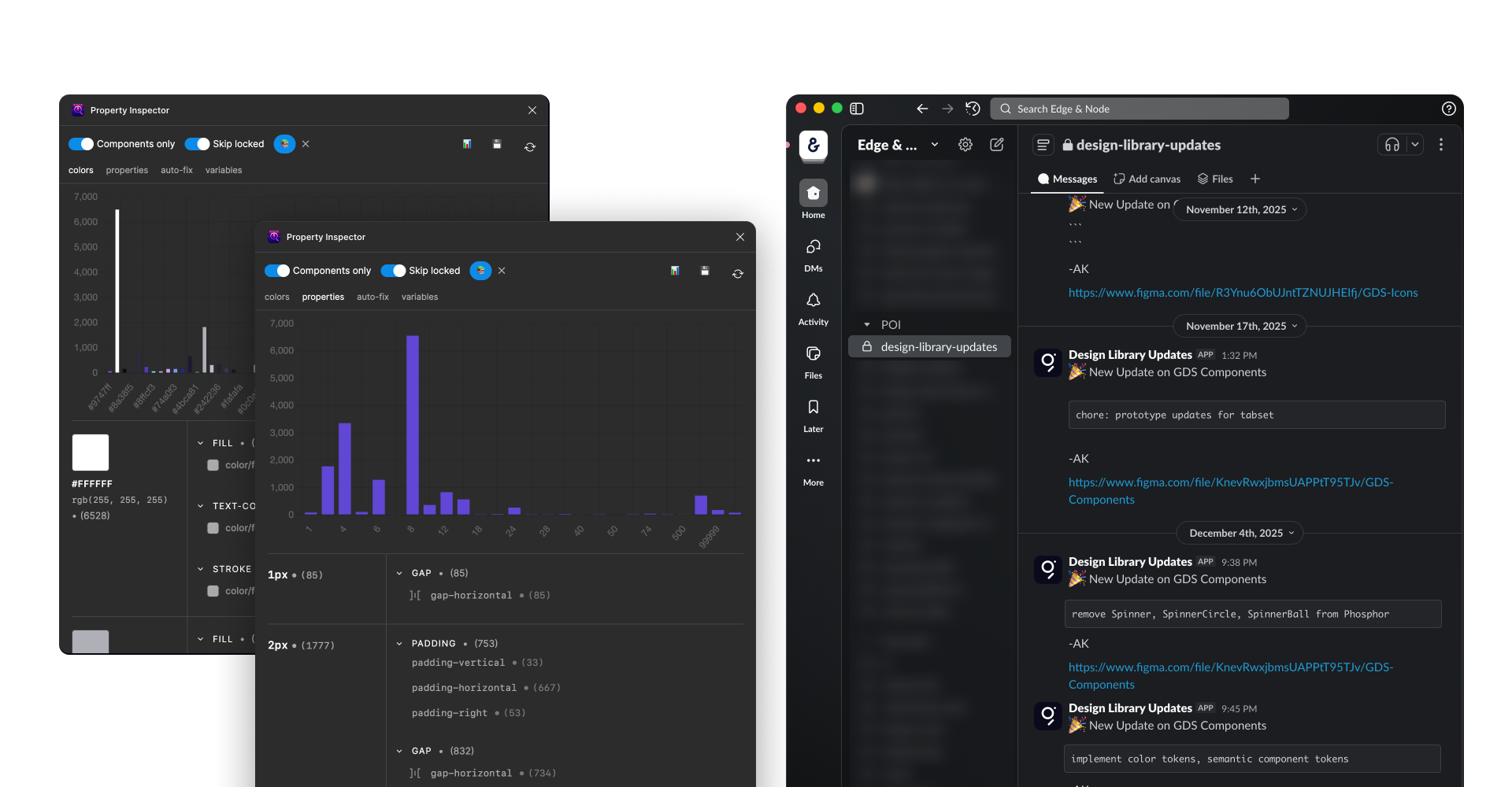
I also built a Slack notification service that runs on a server and posts to a channel whenever our Figma library gets updated. Figma doesn't notify subscribers about library changes, so teams had no way of knowing when new components or fixes were available. Now they do.
Beyond React
GDS was built for The Graph's React products. But at some point a smaller team shipped a documentation site using Astro with a default Starlight theme. It worked, but it looked disconnected from everything else we'd built.
GDS has a CSS-only subset called GDS-CSS that extracts the visual language without requiring React. I applied it to the Astro site and it worked without modification. The tokens, spacing, and typography carried over cleanly. The system adapted to a context it wasn't originally designed for, which validated how we'd structured the foundation.
Outcome
Teams across the organization now use GDS to build interfaces without needing a designer involved in every screen. Data science builds dashboards with it. Product teams move faster because engineers trust that what they see in Figma will match what they ship. Design reviews focus on product decisions instead of catching implementation inconsistencies.
The system works the way a design system should: quietly, in the background, making other people's work easier.